Objectives
- To measure the quantity of urban public transport provision in local government areas in Melbourne between 2015 and 2016
- To explore if and how urban public transport provision has kept pace with population growth.
Method
- Compilation of public transport vehicle kilometres and urban population data for local government areas in Melbourne by year
- Comparison of public transport vehicle kilometres per capita by year.
Key results
Changes in public transport service levels per capita are highly uneven across Melbourne.
Fig. 1 Public transport service provision per capita by local government area in Melbourne, 2016
(Total weekly public transport vehicle kilometres per 1,000 people)
Data source: PTRG analysis of the GTFS file data for Melbourne. Includes bus, rail and tram.
Data production undertaken by Phillip Boyles and Associates.
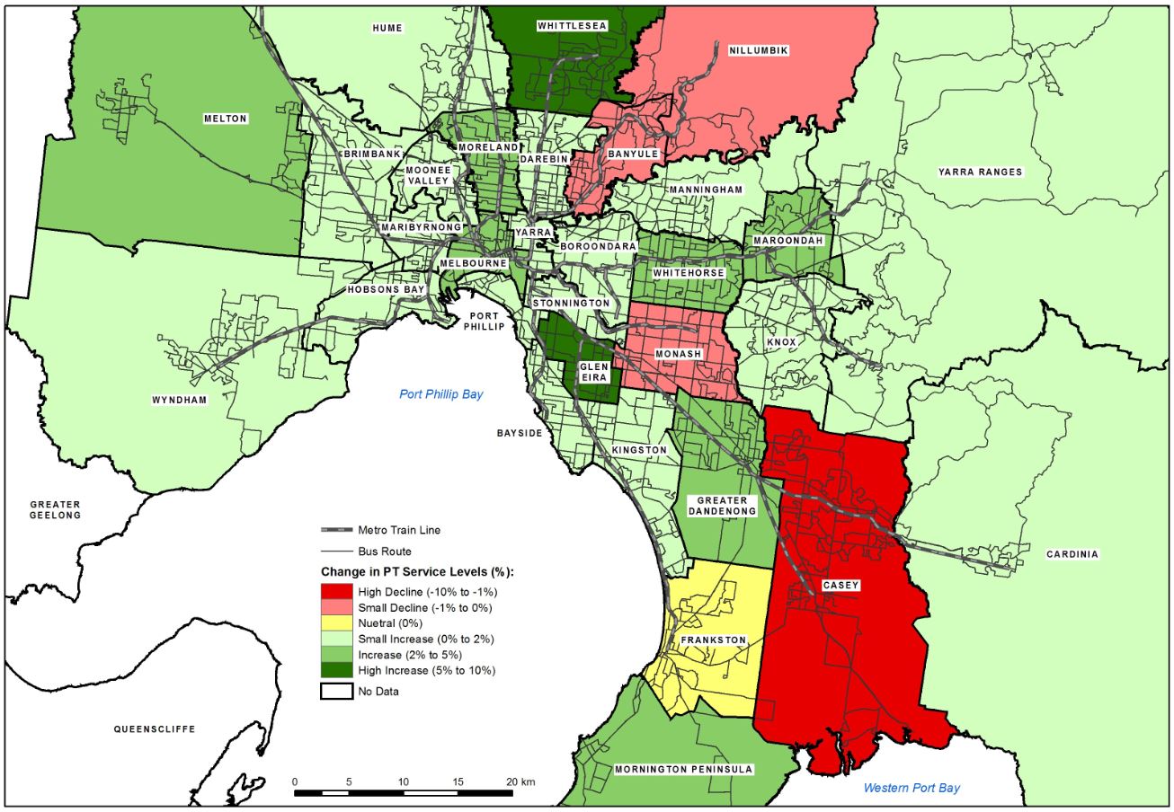
Fig. 2 Change in public transport service provision per capita by local government area in Melbourne, 2015 to 2016
Data source: PTRG analysis of the GTFS file data for Melbourne. Includes bus, rail and tram.
Data production undertaken by Phillip Boyles and Associates.
- The cities of Melbourne, Yarra and Manningham had the highest public transport service provision per capita of all local government areas in Melbourne in 2016; the shires of Cardinia, Mornington Peninsula and Melton have the lowest levels of service provision
- The cities of Whittlesea and Glen Eira experienced the largest increases in public transport service provision per capita (8%) between 2015 and 2016; the city of Casey experienced the largest decrease in service provision (-6%)
- Monitoring public transport service levels per capita over time within cities provides a useful way of determining whether public transport provision is keeping pace with population growth.
Presentations
Currie, G. (2016) Melbourne Transport Problems & Progress – Ideas for Bold Politicians, presented to Academy of Technology, Science and Engineering (ATSE), Parliamentary Briefing, Melbourne, October 2016.


